Color is one of the biggest sales drivers in any hair accessories line. The shape may attract first attention, but the color usually decides whether a buyer says yes, a retailer places an order, or a shopper adds the item to cart. That is why so many brands ask the same question every season: what colors are most popular for hair accessories this year and why?
Suggested image alt text: Flat lay of hair clips, claw clips, headbands, and scrunchies in beige, pastel pink, butter yellow, brown, and black.
What Colors Are Most Popular This Year?
The most popular hair accessory colors this year fall into four commercial groups: neutrals, soft pastels, classic darks, and selective bright accents. This is not random. It reflects how modern shoppers buy beauty-adjacent fashion products. They want accessories that feel current without becoming hard to wear after one month.
That pattern also makes sense when you look at the size and structure of the category. The global hair accessories market was valued at USD 23.41 billion in 2024, and Grand View Research projects it could reach USD 46.64 billion by 2033. The same report notes that elastics and ties accounted for 32.61% of category revenue in 2024, while in the U.S. market the elastics and ties segment held 40.24% share. In other words, the biggest volume still comes from practical products, which helps explain why wearable, repeat-friendly colors remain so important.
Neutral Colors
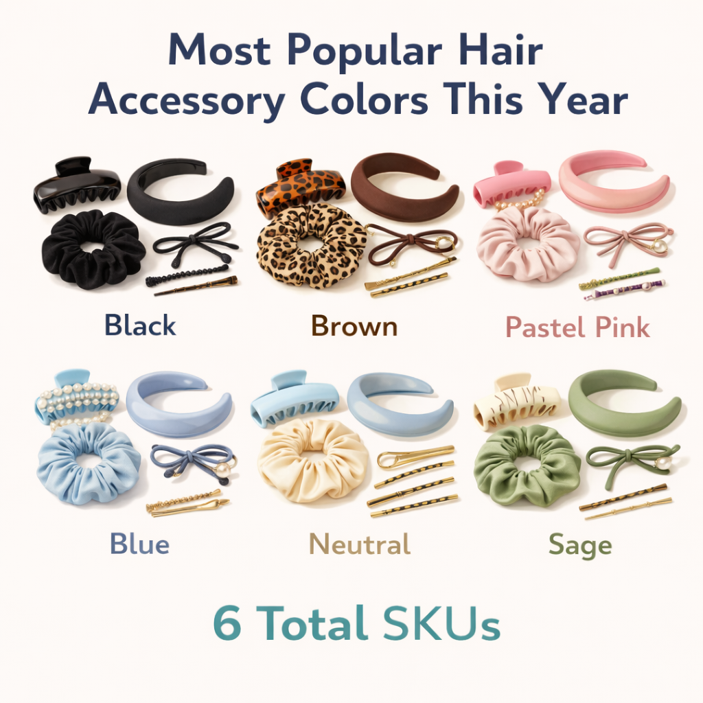
Beige, cream, brown, taupe, and soft gray remain some of the safest and strongest color families for hair accessories. These shades match the ongoing demand for easy styling, low-friction wardrobes, and “quiet luxury” or “clean girl” aesthetics. In practical terms, neutrals sell because they pair well with more outfits, feel less intimidating in online thumbnails, and stay relevant across more months of the year.
Brown has become especially important. Recent spring 2026 fashion coverage highlighted brown as a grown-up neutral that now competes directly with black in everyday styling. For hair accessories, that matters because brown works across acetate clips, padded headbands, satin scrunchies, and matte-finish claws. It looks softer than black, but still polished.
Soft Pastels
Pastel pink, light blue, lavender, and mint are among the most useful trend-supporting colors this year. They work especially well in spring and summer collections, younger customer segments, and products that benefit from a soft, giftable, or romantic mood. These shades also align well with continued interest in soft feminine styling, ballet-inspired dressing, and more delicate color combinations in beauty and fashion.
Pastel blue and mint deserve special attention. Recent 2026 fashion coverage has highlighted sky blue, cerulean, and mint as fresh but wearable shades. That gives these colors extra strength in accessories, where customers often prefer trying trend colors in small, lower-risk products before buying them in larger fashion pieces.
Classic Dark Colors
Black, navy, deep brown, and burgundy still matter. They may not always dominate trend headlines, but they remain fundamental because they carry the category in fall, winter, gifting, uniform-friendly dressing, and daily use. Black continues to be the easiest replenishment color in clips, hair ties, and headbands. Burgundy has also gained new momentum because it gives customers something richer and more directional than black without feeling hard to style.
Seasonal Brights
Coral, cherry red, butter yellow, and bright sky blue are the strongest bright accents for this year. These are not “base business” colors for every brand, but they are excellent for capsules, campaign imagery, summer drops, and products meant to attract first attention. Pinterest’s 2025 Palette identified Cherry Red and Butter Yellow as major emerging colors, and those tones continue to show up in 2026 fashion and beauty coverage. That kind of momentum matters because it helps a color feel familiar before it reaches the accessory shelf.
| Color Group | Best Example Shades | Why It Sells | Best For |
|---|---|---|---|
| Neutrals | Beige, cream, brown, soft gray | Easy to wear, low return risk, timeless | Core year-round assortment |
| Soft pastels | Pastel pink, lavender, light blue, mint | Fresh, seasonal, giftable, youthful | Spring/summer launches |
| Classic darks | Black, navy, deep brown, burgundy | Reliable, polished, practical | Core basics and fall/winter |
| Bright accents | Cherry red, butter yellow, coral, sky blue | Attention-grabbing and trend-led | Capsules, campaigns, limited editions |
Internal link prompt: Add an internal link on “custom hair accessories collection” to the Q&N Beauty custom service page.
Suggested image alt text: Trending hair accessory colors for this year shown as swatches beside clips and scrunchies.
Why These Are the Most Popular for Hair Accessories This Year
These shades are popular because they sit at the intersection of consumer behavior, visual trend cycles, and retail practicality. The strongest colors are rarely the loudest. They are the ones that help customers feel both current and comfortable.
Consumers Want Wearability First
Most shoppers do not build their wardrobe around hair accessories. They use hair accessories to complete outfits, simplify routines, or add a small visual lift. That makes wearability essential. Neutrals and dark shades win because they are easy to match, easy to repurchase, and easy to justify. Even fashion-conscious customers often prefer to experiment with color in a low-risk way, which is why pastel clips, mini bows, and colorful claws perform well.
Grand View Research’s segment data supports this logic. Since elastics and ties remain the largest revenue share of the category, utility still drives a huge part of demand. Utility products almost always perform best in colors customers can use repeatedly.
Fashion and Social Media Are Pushing Softer, More Curated Color Stories
Social media does not just create “viral colors.” It also changes what feels tasteful. In 2026 coverage, fashion editors have repeatedly highlighted rich browns, pastel blues, mints, and butter yellow, while spring accessory coverage has featured tortoiseshell, padded browns, metallic details, and romantic accents like lace or floral finishes. That tells brands something important: this year’s color direction is not based on pure maximalism. It is based on edited freshness.
That is also why soft pastels are outperforming many harsher brights. They photograph beautifully, look clean in flat lays, and fit the emotional tone of contemporary beauty and lifestyle content.
Retail Buyers Think in Risk Layers
Buyers rarely choose colors only because they are trendy. They choose them because they balance sell-through probability and display impact. Neutral shades are safer. Pastels help seasonal campaigns feel fresh. Deep colors extend the selling window. Bright colors create visual hooks. A collection that uses all four layers intelligently is easier to merchandise than one that relies on only one mood.
Color Trends Now Move Across Categories
Another reason these colors are gaining traction is that fashion, beauty, home, and lifestyle trends increasingly influence one another. Cherry red, butter yellow, cerulean, and mint have appeared in broader trend reporting, while brown and creamy off-whites remain central to minimalist styling. When customers see a color repeatedly across clothing, nails, shoes, home décor, and beauty packaging, they become more open to seeing it in accessories too.
| Driver | What It Means | Color Impact |
|---|---|---|
| Repeat wear | Customers want easy styling | Helps neutrals and darks stay strong |
| Seasonal freshness | Newness still matters | Supports pastels and selective brights |
| Social media aesthetics | Soft, refined visuals perform well | Boosts cream, blush, pale blue, mint |
| Retail risk control | Buyers avoid overcommitting to fads | Creates a 70/30 safe-to-trend mix |
External link prompt: Add a source link here to fashion trend coverage from Who What Wear, Vogue, or Byrdie discussing 2026 color direction.
Suggested image alt text: Mood board showing quiet luxury neutrals, soft feminine pastels, and bright accent hair accessories.
How to Use the Most Popular Colors for Hair Accessories This Year
Knowing the trend is useful. Applying it well is where the money is made. The strongest brands do not simply copy the most visible shades. They build a color structure that matches their customer, channel, and price point.
Build a Color Hierarchy
A commercial collection needs layers. The easiest framework is:
- Base colors: black, cream, beige, brown, navy
- Trend colors: pastel pink, sky blue, lavender, mint, butter yellow
- Accent colors: cherry red, coral, metallic finishes, jewel tones
This structure prevents overbuying into one trend and keeps the line coherent. It also helps marketing teams build stronger visuals because every launch contains stable anchors and fresher highlights.
Use Seasonal Palettes, Not Random Add-Ons
Spring and summer should lean lighter, airier, and clearer. That usually means cream, blush, pale blue, butter yellow, and mint. Autumn and winter perform better with richer, moodier, and more tactile shades such as black, espresso brown, burgundy, deep navy, and forest-adjacent tones. When color follows season, the collection feels more intentional and more aligned with how customers already shop.
Adjust the Ratio by Brand Positioning
A minimalist brand can stay heavily neutral. A youth brand can lean further into pastel and brights. A gift-led brand can use more romantic shades. A fashion-forward boutique line can introduce more limited-run color capsules. The trend is only the starting point. Brand identity decides the final balance.
Use the 70/30 Rule
For most brands, a practical formula is 70% safe colors and 30% trend colors. Safe colors protect reorder business and lower dead stock risk. Trend colors make the assortment look current, help storytelling, and create launch moments. This mix is especially effective for brands serving wholesalers or multi-store retailers, because it gives buyers confidence without making the collection look flat.
| Collection Layer | Recommended Colors | Recommended Share |
|---|---|---|
| Core business | Black, cream, beige, brown, navy | 50–70% |
| Seasonal trend | Pastel pink, lavender, light blue, mint, butter yellow | 20–30% |
| Accent / campaign | Cherry red, coral, metallics, statement shades | 10–20% |
Internal link prompt: Add an internal link on “wholesale hair accessories manufacturer” to the homepage and on “OEM/ODM support” to the custom service page.
Suggested image alt text: Brand color planning chart for a hair accessories collection using a 70-30 ratio of core and trend colors.

Best Hair Accessory Colors by Product Category
Not every color performs the same way in every product. Material, scale, visibility, and use case all affect what works best. A shade that feels beautiful on a satin scrunchie may feel too weak on a bulky claw clip. A bold cherry red bow may sell well at holiday, but the same red on a daily headband may feel too specific for some customers.
Claw Clips and Hair Clips
These categories perform best in neutrals, tortoiseshell-inspired browns, black, cream, and selected pastels. Why? Clips are often styled as visible “mini accessories,” so customers want them to coordinate with clothing and jewelry. Brown, cream, black, and tortoiseshell are versatile. Pastel blue, blush, and lavender are useful when the product is more playful or seasonal.
Scrunchies and Hair Ties
Soft goods can support a wider color range because they feel more forgiving and more impulse-friendly. Satin scrunchies do especially well in cream, champagne, blush, black, cocoa, dusty blue, and lavender. Brights can work here too, particularly in gift sets or multipacks, because customers like variety when the price barrier is lower.
Headbands and Bows
These are the most styling-sensitive categories, which means color can strongly affect perceived fashion level. Padded headbands look more elevated in brown, black, deep burgundy, or elegant pastels. Bows can go softer and sweeter in blush, ivory, butter yellow, pale blue, or occasion-driven red. If the brand aesthetic is romantic or feminine, pastels have more room here than in utility-focused clips.
Gift Sets and Seasonal Capsules
Gift sets benefit from story-led color combinations. A spring box might pair cream, pastel pink, and mint. A holiday set might combine black, burgundy, champagne, and metallic gold. Seasonal capsules do not need to be large. In fact, tighter palettes often look more premium and easier to buy.
| Product Type | Best Core Colors | Best Trend Colors |
|---|---|---|
| Claw clips | Black, cream, brown, tortoiseshell | Pastel blue, blush, lavender |
| Snap clips / barrettes | Black, navy, beige | Cherry red, sky blue, metallics |
| Scrunchies | Cream, blush, black, cocoa | Mint, lavender, butter yellow |
| Headbands | Black, brown, deep burgundy | Pastel pink, pale blue, pearl tones |
| Bows / ribbons | Ivory, black, navy | Butter yellow, cherry red, blush |
Internal link prompt: Add links where relevant to the Q&N Beauty butterfly clip article and claw clip hairstyles article.
Suggested image alt text: Product-category chart showing best-selling color families for claw clips, scrunchies, headbands, and bows.
Case Study: What Retail Winners Reveal About Color
One of the best ways to understand color strategy is to study brands that are already converting at scale. Public retail examples do not reveal every internal sales number, but they do reveal patterns in assortment, merchandising, and review density.
KITSCH: Everyday Colors Plus Fashion Add-Ons
KITSCH is a strong example of how to build breadth without losing clarity. Its public assortment spans hair clips, bobby pins, scrunchies, and headbands, while product pages show strong consumer response to everyday shades such as black, tortoiseshell-inspired tones, and soft neutrals. At the same time, the brand introduces fashion-driven color or fabric stories, such as satin rosettes, terracotta tones, or collaboration shades. The lesson is clear: basics drive continuity, but special colors keep the assortment alive.
The Hair Edit: Category Architecture Supports Color Storytelling
The Hair Edit publicly organizes its line into claw clips, ponytail holders, bobby pins, headbands, French pins, barrettes, and bundles. Within that architecture, color can move more strategically. Soft pink and blue butterfly clip sets, metallic stories, and fashion-led bundles work because the shopper can still anchor the purchase in familiar categories. The brand is not using color to replace product logic. It is using color to strengthen it.
What Smaller Brands Should Learn
Smaller brands often assume they need many colors to look established. In reality, a more useful lesson from successful retailers is disciplined repetition. Strong brands repeat their best neutrals, extend successful seasonal shades into several product forms, and limit novelty to a manageable share of the line. That keeps the display coherent and increases the chance that one winning shade becomes a recognizable brand signal.

A Simple Takeaway for Wholesale Buyers
If you are a wholesaler, boutique buyer, or private-label brand, the smartest move is not to ask, “What is the hottest color?” Ask, “Which colors will keep selling after the first visual hit?” The best assortments combine proven base colors with a few trend-led options that make the collection feel new.
| Retail Pattern | What It Shows | How to Apply It |
|---|---|---|
| Best sellers stay wearable | Core shades build repeat demand | Keep neutrals in stock across key categories |
| Trend shades appear in capsules | Freshness matters, but should be controlled | Use limited colors for seasonal moments |
| Bundles use softer stories well | Pastels and coordinated shades raise gift appeal | Create thematic sets rather than scattered singles |
External link prompt: Add links here to public category or best-seller pages from KITSCH and The Hair Edit.
Suggested image alt text: Retail case study collage showing neutral and pastel hair accessories arranged like a best-seller display.
Pros and Cons of Following Color Trends
Color trends are useful, but they are not automatically profitable. The value comes from how they are used.
Pros
- Stronger newness: Trend colors help launches feel current.
- Better content performance: Fresh shades often work well in campaigns and social posts.
- Higher perceived design value: A trend-right palette can make even simple shapes feel updated.
- Gift and capsule opportunities: Special colors are ideal for seasonal sets and limited editions.
Cons
- Higher inventory risk: Overbuying a short-lived color can leave dead stock.
- Brand dilution: Following every trend can weaken a brand’s identity.
- Display inconsistency: Too many unrelated shades make the collection look messy.
- Weaker reorder confidence: Retail buyers may hesitate if the palette feels unstable.
Best Practice
The best approach is selective trend adoption. Use trend colors where they create marketing energy, but let your core shades carry the business. That is how brands stay current without becoming chaotic.
| Approach | Upside | Risk |
|---|---|---|
| All-in on trend shades | High visual impact | Higher markdown and inventory risk |
| All core colors | Safe and reorder-friendly | Can feel flat or outdated |
| Balanced core + trend mix | Best blend of stability and freshness | Requires more deliberate planning |
Suggested image alt text: Side-by-side comparison of safe neutral hair accessories versus bright trend-led capsule colors.
What Good Color Planning Can Deliver
Good color planning improves more than aesthetics. It affects margin, sell-through, photography, merchandising, and the way buyers understand the whole line.
Higher New-Launch Success Rates
When a launch uses a controlled mix of proven and directional shades, it has a better chance of resonating quickly. Customers recognize something familiar but still feel they are seeing something new.
Lower Inventory Risk
Color discipline keeps brands from spreading too much stock across weak or overlapping shades. That is especially valuable for small and mid-size collections, where every SKU decision matters.
Better Brand Consistency
Repeated color stories help customers recognize your line. Over time, that can become part of brand memory, especially when the same colors appear across clips, scrunchies, headbands, pouches, and sets.
Easier Wholesale Selling
Retail buyers prefer assortments they can understand quickly. A structured palette gives them clearer entry points: best-selling neutrals, seasonal updates, and one or two marketing colors. That makes the collection easier to buy and easier to display.
| Result | How Color Planning Helps |
|---|---|
| New launch performance | Combines familiarity with trend appeal |
| Inventory control | Reduces duplication and overbuying |
| Collection identity | Creates a more unified, memorable line |
| Buyer confidence | Makes the assortment easier to understand and reorder |
Internal link prompt: Add an internal link on “organize hair accessories” to the relevant Q&N Beauty blog article.
Suggested image alt text: Coordinated retail display showing how planned hair accessory colors improve collection unity.
FAQ
What colors are most popular for hair accessories this year?
The strongest overall groups are neutrals such as beige, cream, brown, and soft gray; soft pastels such as pastel pink, light blue, lavender, and mint; classic dark shades such as black, navy, and burgundy; and a small number of bright accents like cherry red and butter yellow.
Why are neutral colors still so strong?
Because they are easy to wear, easy to reorder, and easy for retailers to merchandise. In a category where utility remains a major driver, versatile shades keep performing.
Are bright colors a bad choice for hair accessories?
No. They are valuable when used strategically. Bright shades work especially well in capsules, seasonal stories, campaign imagery, and lower-risk products like clips, bows, or gift sets.
Which colors work best for spring and summer?
Cream, blush, butter yellow, pastel blue, lavender, and mint are especially effective for spring and summer because they feel lighter, fresher, and more seasonal.
Which colors work best year-round?
Black, beige, brown, cream, navy, and deep burgundy tend to have the broadest year-round use across categories.
How many trend colors should a brand add to a collection?
For many brands, keeping trend shades at around 20% to 30% of the collection is a practical range. That usually gives enough freshness without making inventory too risky.
Should every product category use the same colors?
No. Color should adapt to the product. Utility-driven clips need different color logic than bows, headbands, or satin scrunchies. The best collections keep overall harmony while tailoring the palette to the product type.
Suggested image alt text: FAQ graphic about the best-selling hair accessory colors this year.
Conclusion
The most popular colors for hair accessories this year are not defined by extremes. They are defined by a blend of wearability, softness, polish, and selective novelty. Neutrals still anchor the category. Pastels bring seasonal freshness. Dark shades provide dependable year-round business. Bright accents create energy when used carefully.
The real competitive advantage is not chasing every color trend. It is translating the right trends into a collection that matches your customer and your sales channel. For most brands, that means building around stable colors first, then layering in trend shades where they can deliver attention without creating excess risk.