Knowing how to display hair accessories well is no longer a small detail. Whether you are organizing your bedroom, styling a retail shelf, or building a product grid for an online shop, presentation changes how quickly people notice an item, understand it, and decide to use or buy it. That matters in a category that keeps growing: Grand View Research estimates the global hair accessories market reached USD 23.41 billion in 2024 and projects continued expansion through 2033.[1]
Why Hair Accessory Display Matters
1. Why presentation changes buying intent
Hair accessories are highly visual, low-touch, comparison-heavy products. Customers usually decide fast. They ask simple questions: What is it? How big is it? Will it match my hair, outfit, or mood? Can I use it easily? A strong display answers those questions quickly, while a messy one creates friction.
That is true offline and online. Nielsen Norman Group explains that clear visual hierarchy guides the eye through color contrast, scale, and grouping.[4] In plain language, that means shoppers need one clear place to look first, one clear way to compare options, and enough breathing room to understand what they are seeing. When every scrunchie, claw clip, and barrette competes equally, nothing stands out.
2. Why better display makes organizing and selecting easier
A good display is not only about beauty. It is also about retrieval. At home, it reduces the time spent digging through drawers. In stores, it shortens decision time and improves browse flow. Online, it lowers bounce and helps customers reach the right product page faster. Salsify’s research shows that 76% of shoppers say high-quality product images are very or extremely important to whether they click a product page from search results, and its newer 2026 research says images and videos are now the most important PDP element when completing a purchase.[5][6]
3. The difference between home and retail display
Home display is built around convenience and personal habits. Retail display is built around discovery and sell-through. Online display is built around clarity, confidence, and conversion. The same accessory may need three different presentation strategies depending on the setting.
| Setting | Main Goal | Best Display Logic | What Usually Goes Wrong |
|---|---|---|---|
| Home | Easy access and tidy storage | Sort by frequency of use and product type | Everything goes into one box or drawer |
| Retail store | Attract attention and increase purchase | Zone by category, color, price, or occasion | Too many SKUs at eye level with weak signage |
| Online shop | Help shoppers compare and click confidently | Consistent thumbnails, grouped variants, clear filters | Visual clutter, duplicate listings, weak photography |
Different Ways to Display Hair Accessories
1. The best display formats for clips, scrunchies, and claw clips
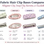
Different products need different fixtures. Slim, flat items such as snap clips and barrettes display best vertically because shape and finish are easier to compare at eye level. Soft items like scrunchies and headbands need room to show fabric volume and texture. Larger claw clips need spacing so customers can judge size, hinge shape, and jaw opening.
| Product Type | Best Home Display | Best Retail Display | Best Online Display |
|---|---|---|---|
| Hair clips / barrettes | Ribbon board, tray divider, slim wall rail | Pegboard, display cards, countertop stand | Front image + close-up detail + scale image |
| Scrunchies / hair ties | Glass jar, open basket, shallow compartment tray | Tiered bowl, rail display, grouped bins by color | Flat lay + worn shot + color swatch grouping |
| Claw clips | Tiered stand, drawer with dividers | Acrylic risers, shelf grouping, checkout add-on | Hero image + open/closed angle + model usage |
| Headbands / bows | Hook rail, hanger, vertical rod | Head form, wall rail, theme set display | Styled model image + texture close-up |
2. Desktop, hanging, and layered displays: how they differ
Desktop displays work best when the assortment is small and curated. They feel intentional, but they can get crowded fast. Hanging displays save space and reveal shape clearly, making them strong for clips and carded accessories. Layered displays, such as risers or shelves, are ideal when you want depth and premium presentation without stacking products directly on top of one another.
3. How to make small spaces look neat
Small spaces improve when you go vertical and reduce category mixing. Use one visual rule per zone. For example, left side for metal clips, center for neutral scrunchies, right side for statement items. Repetition creates calm. Randomness creates noise.
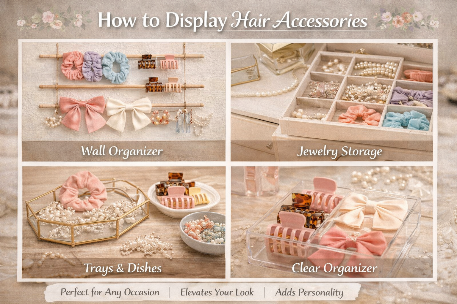
How to Display Hair Accessories at Home
1. Simple home display ideas that actually work
The best home systems are easy to reset. If a storage idea looks beautiful but takes ten minutes to restore every morning, it usually fails. A practical home setup uses open visibility, light category labels, and the least number of movements possible.
Three reliable home formats are:
- Open tray system: Good for everyday clips, elastics, and mini claws.
- Vertical board system: Best for bows, snap clips, and statement barrettes.
- Jar-and-stand system: Works well for scrunchies in jars and larger claws on stands.
2. How to separate daily-use and occasional accessories
A simple frequency split solves most home clutter. Keep daily-use items within arm’s reach and special pieces slightly farther away. Think in terms of behavior, not only type. A satin scrunchie you wear every night should not be stored in the same area as bridal pins or holiday bows.
| Use Frequency | Where to Place It | Examples |
|---|---|---|
| Daily | Top tray, vanity edge, bathroom shelf | Hair ties, basic clips, neutral claws |
| Weekly | Secondary drawer or wall organizer | Headbands, fashion clips, work sets |
| Occasional | Labeled box or upper shelf | Party bows, bridal pieces, seasonal items |
3. How to balance beauty with easy access
Start with your real routine. Which side do you reach with? Do you style your hair in front of a mirror or near a closet? Are you choosing accessories by outfit color or by hairstyle? The display should follow the way you already move. A good home display is not a museum. It is a visual shortcut.

How to Display Hair Accessories in Retail Stores
1. Which categories to prioritize first
In stores, the first job of the display is to help people enter the category. That means leading with familiar, easy-to-understand products. Usually these are hair ties, basic clips, and bestselling claw clips. Statement pieces, premium sets, and seasonal accessories can sit nearby, but they should not block the entry point.
Grand View Research reports that hair elastics and ties accounted for 32.61% of the market in 2024.[1] That is a practical reminder: basics deserve prime visibility because they often anchor the category and make the rest of the assortment easier to browse.
2. How to zone by color, collection, or occasion
Retail zoning works best when the customer can understand the logic without asking for help. Color zoning suits trend-led assortments. Collection zoning suits branded stories. Occasion zoning works especially well for gifting, bridal, school, holiday, and travel.
Color zoning works well when:
- Your assortment is fashion-driven
- Customers browse visually first
- You want strong social-media-friendly impact
Collection or occasion zoning works well when:
- You sell matching sets
- You want higher basket value
- You need gift-ready or seasonal storytelling
3. How to make browsing and try-on easier
Shopify’s merchandising guidance notes that smaller accessories tend to work well on freestanding displays, display cases, and glorifiers.[7] For hair accessories, that translates into easy-to-scan pegs, clear category cards, and enough negative space around hero products. Keep mirrors nearby when possible. Add one “how to wear it” visual card for updos, ponytails, and half-up styles. The customer should not need imagination to finish the purchase.
Academic research also shows that display placement matters. A 2022 Journal of Retailing study found that displays closer to the focal category had stronger impact, with front end caps showing the largest effect on category purchase, and optimized display allocation producing an average 11.15% revenue increase in the modeled setting.[3] For a hair accessory retailer, that means your strongest story should sit where shoppers naturally expect the category, not only in a decorative side corner.
| Retail Zone | Best Products | Why It Works |
|---|---|---|
| Eye-level wall or main bay | Bestsellers, basics, new arrivals | Fast category entry and stronger comparison |
| Countertop / checkout | Mini clips, elastics, impulse gifts | Low-friction add-on purchase |
| Feature table or end cap | Seasonal themes, bridal, gift sets | Storytelling and occasion-based shopping |
| Lower shelf or secondary area | Backstock styles, extra colors, multipacks | Supports depth without crowding premium area |

How to Display Hair Accessories for Online Shops
1. Why digital display is really a merchandising problem
Many brands treat online display as a photography issue only. It is not. It is also a category architecture issue. Baymard warns that poor product list UX makes it hard for users to find suitable items, and one of its practical recommendations is to combine variations into a single listing instead of cluttering the grid with duplicates.[2] This is especially important for hair accessories because one style may exist in six colors and three sizes.
2. What online customers need to see before they trust the product
Salsify’s 2026 consumer research says product images and videos are the most important PDP element for purchase completion, and one in three shoppers abandon because of low-quality or missing images and videos.[6] For hair accessories, visual proof is the product. Customers cannot feel the spring tension of a claw clip or the softness of a scrunchie through the screen, so your content has to do that work.
| Online Asset | What It Answers | Why It Matters |
|---|---|---|
| Clean hero image | What is it? | Improves first click and category scan |
| Close-up texture shot | What is it made from? | Builds quality perception |
| Scale image on model or hand | How big is it? | Reduces disappointment and returns |
| Styled hairstyle image | How do I wear it? | Creates aspiration and use-case clarity |
| Video or open/close sequence | How does it function? | Useful for claw clips, combs, and headbands |
3. How to display hair accessories for better ecommerce browsing
- Use one clean background style for the category.
- Keep thumbnail scale consistent so size differences are intentional, not confusing.
- Group color variants under one listing where possible.
- Add filters for color, material, occasion, size, and product type.
- Show at least one lifestyle image for each core style.
- Use short labels such as “best for thick hair,” “lightweight,” or “bridal set.”
There is another trend worth noting. Etsy’s 2026 seasonal report says shoppers are responding to expressive details, handcrafted textures, joyful color, and meaningful keepsakes, and it specifically advises sellers to update photos with on-trend styling and seasonal details.[8] For online hair accessory shops, that means your display should not be generic year-round. Seasonal styling can make the same SKU feel newly relevant.
Common Display Mistakes to Avoid
1. Why overfilling a display reduces appeal
More product is not always more sellable. When a customer sees thirty similar pieces pressed together, comparison becomes work. Overfilled displays flatten perceived value. Premium pieces start to look cheap because nothing has room to breathe.
2. Why mixed styles make shopping harder
One common mistake is mixing everyday basics, bridal accessories, children’s bows, and trend-led statement clips in one visual block. The result is cognitive friction. The customer has to mentally sort the display before shopping it. That is wasted effort.
3. What happens when you ignore lighting, labels, and layers
Small accessories disappear without visual support. Bad lighting kills shine, texture, and material contrast. Missing labels create hesitation. Flat displays without height variation look unfinished. NNGroup’s guidance is useful here: hierarchy depends on contrast, scale, and grouping.[4] If your display lacks all three, customers must work too hard to decode it.
Red flags to fix immediately
- Multiple product types hanging on the same hook
- No bestsellers or new arrivals sign
- Too many duplicate color cards facing front
- Product photos online with inconsistent cropping
- No scale cue for mini or oversized accessories

How to Create a More Attractive Hair Accessory Display
1. Use color intentionally
Color is one of the fastest ways to create order. You can block by neutrals, pastels, brights, metallics, or seasonal palettes. But do not use every color equally. Create one dominant story and one supporting story. That keeps the eye moving without causing chaos.
2. Use props and materials to raise perceived value
Material choice changes price perception. Linen, light oak, matte acrylic, brass accents, velvet pads, and clean ceramic trays all signal different price points. The display material should fit the product mood. Pearl bridal combs need a softer setting than sporty elastics.
3. Make the display fit seasonal or promotional themes
Seasonal displays work when the theme changes the context, not just the label. A summer display may use brighter light, airy spacing, and vacation styling. A bridal display may use softer backdrops, updo cards, and pearl or crystal groupings. Etsy’s current trend reporting suggests that handcrafted textures, garden-inspired celebration details, and romantic storytelling are resonating with shoppers, especially around weddings and spring occasions.[8]
| Theme | Display Colors | Best Product Focus | Support Props |
|---|---|---|---|
| Everyday minimal | Beige, black, cream, soft brown | Basics, neutral claws, satin scrunchies | Matte trays, clear labels, mirror |
| Gift / holiday | Deep red, gold, evergreen, silver | Sets, bows, embellished clips | Boxes, ribbons, occasion signage |
| Bridal / event | Ivory, pearl, blush, champagne | Combs, pins, headbands, statement clips | Soft fabric pads, hairstyle cards |
| Gen Z trend edit | Joyful color, mixed texture accents | Playful clips, statement bows, novelty styles | Styled lifestyle imagery, social tags |
Case Study and Expert Takeaways
Real case study: what an accessories brand can teach hair accessory sellers
A useful adjacent-category example comes from Northbanks’ visual merchandising work for Orelia, a British accessories brand. According to the case study, the brief was to create wholesale fixtures that hero products and improve presentation. The solution used a mix of vertical and horizontal surfaces, glass showcases, stands, pegboards, and display elements designed to elevate premium perception while remaining flexible for assortment changes. The article also notes that the best display “real estate” is at eye or countertop level, and that customers connected more strongly with the new fixtures, increasing brand exposure and sales.[9]
Although this example is from jewelry and accessories rather than hair accessories specifically, the lesson transfers well: small products sell better when the fixture architecture makes browsing intuitive, premium cues are intentional, and the eye is guided through the assortment rather than forced to hunt.
What the research says
- Market demand is real: the hair accessories market continues to grow globally.[1]
- Display location matters: physical placement influences purchase behavior and revenue potential.[3]
- Visual hierarchy matters: grouping, contrast, and scale reduce visual confusion.[4]
- Digital display quality matters: images and videos strongly affect clicks, trust, and returns.[5][6]
Expert recommendation
Do not begin with fixtures. Begin with the decision journey. Ask: what does the shopper need to understand first? Category? Occasion? Material? Size? Once you know the first decision, the right display becomes much easier to build.
When to Use Wholesale or Custom Collections
If you are displaying hair accessories for a boutique, chain store, salon, or ecommerce brand, display quality depends on assortment quality. It is much easier to build a clean display when the collection already has consistent packaging, coordinated colors, clear category segmentation, and retail-ready sizing.
That is where wholesale or custom development becomes useful. Instead of patching together random items from mixed suppliers, you can work with a manufacturer that helps you build a display-ready collection with consistent materials, cards, labels, and color stories. For B2B buyers or retailers building private-label assortments, a wholesale partner such as QN Beauty can be a practical next step for custom or bulk hair accessory collections.
Conclusion: Display Hair Accessories Like a Shopper Sees Them
To display hair accessories well, think less about storage and more about decision-making. At home, the goal is speed and convenience. In retail, the goal is clarity, discovery, and basket building. Online, the goal is confidence, comparison, and conversion. The best displays do not show everything at once. They show the right things in the right order.
Looking ahead, the category will likely become even more visual, trend-responsive, and occasion-led. As the market grows and shoppers expect better product storytelling, displays that combine clean hierarchy, stronger imagery, and better assortment logic will have a real advantage.[1][8]
If you are planning a private-label launch, store refresh, or display-ready assortment, review your current category structure first, then match the fixture, photography, or packaging to that structure. That is how attractive displays start turning into better conversions.
FAQ
What is the best way to display hair accessories at home?
The best method is a simple category system that matches your daily routine. Keep everyday items visible and easy to grab, and move special-occasion pieces into secondary storage.
How do stores display hair accessories?
Most stores group by category, color, price, or occasion, then place bestselling or impulse-friendly products at eye level or near checkout.
How can I make hair accessories look more attractive?
Use clean spacing, color blocking, layered heights, matching materials, and better lighting. Online, add close-up detail shots and styled images.
What is the best way to organize and display hair clips?
Hair clips usually display best on boards, pegs, slim cards, or divided trays. Avoid stacking too many on one hook.
How do I display hair accessories for online sales?
Use consistent thumbnails, grouped variants, filters, scale references, texture close-ups, and one lifestyle image per key SKU.
What display works best for small spaces?
Vertical systems are usually the best choice. Wall rails, pegboards, slim stands, and simplified digital layouts all help smaller spaces feel organized instead of crowded.
- [1] Grand View Research, Hair Accessories Market Size, Share & Forecast.
- [2] Baymard Institute, Product List UX 2025: 8 Common Pitfalls & Best Practices.
- [3] Journal of Retailing / ScienceDirect, Impact of Different Types of In-Store Displays on Consumer Purchase Behavior.
- [4] Nielsen Norman Group, Visual Hierarchy in UX: Definition.
- [5] Salsify 2024 Consumer Research Report, The Modern Buying Journey.
- [6] Salsify, Why Images and Videos Are the Most Important Product Page Elements.
- [7] Shopify, Product Merchandising: Effective Retail Display Ideas.
- [8] Etsy Seller Handbook, Seller Trend Report: Spring and Summer 2026.
- [9] Modern Retail, Northbanks Visual Merchandising Case Study.