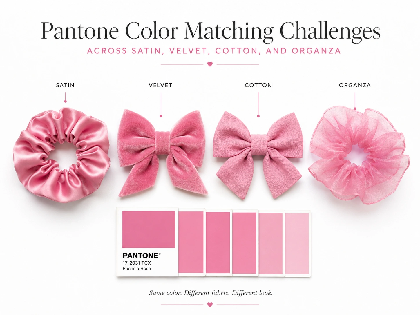
This guide covers the four fabrics, Pantone TCX, lab dips, strike-offs, controlled lighting, metamerism, Delta E tolerances, multi-fabric approval, case studies, and buyer specifications.
Why Pantone Color Matching Changes by Fabric
Fabric Fiber Composition
Different fibers require different dye classes and processes. Cotton commonly uses reactive or related cellulosic systems, while polyester satin and organza commonly use disperse dyes. Nylon, silk, viscose, acetate, and blends need other formulations.
One Pantone target therefore needs separate recipes by substrate. Similar measured hue can still produce different depth, saturation, and undertone.
Surface Texture and Light Reflection
Color is perceived from reflected and transmitted light. Datacolor notes that gloss, opacity, roughness, and other surface characteristics affect instrumental and visual assessment.
Satin produces directional highlights, velvet creates pile-driven light and dark areas, cotton scatters light through a matte surface, and organza transmits background color.
Fabric Thickness and Transparency
Opaque fabric hides the backing after enough layers are folded beneath the measurement area. Sheer organza does not, so backing color and layer count must be fixed.
Dyeing and Finishing Processes
Heat setting, washing, softening, optical brighteners, calendering, brushing, and coatings can change appearance. Approve the sample after the final intended finish.
| Variable | Visual effect | Control method |
|---|---|---|
| Fiber composition | Changes dye affinity, depth, and undertone | Create a separate dye recipe and standard for each substrate. |
| Surface gloss | Creates highlights and viewing-angle shifts | Standardize orientation, lighting, and viewing angle. |
| Opacity | Allows backing color to influence appearance | Define backing and number of layers. |
| Finish | Can change whiteness, luster, softness, and reflectance | Approve after the final intended finish. |
| Production batch | Creates dye-lot variation | Set lot-control and shade-banding requirements. |
Expert principle: A Pantone code describes the color target. It does not describe how every fabric must reflect, transmit, or scatter light.
Pantone Color Matching Challenges With Satin
Shine and Directional Light Reflection
Satin is a weave structure that may use polyester, silk, acetate, nylon, or blends. Long surface floats create a smooth face with strong directional reflection.
A satin swatch can look pale in its highlight direction and darker after rotation. Review at least two orientations and take multiple instrumental readings.
Color Changes Under Different Lighting
Satin can amplify metamerism as highlights shift with illuminant and angle. X-Rite defines D65 as average daylight at about 6500 K, but products may also face retail LED, TL84-type, or warm home light.
Name a primary illuminant and a secondary retail condition. Do not assume the factory and buyer use the same light source.
Dye Lot Consistency
Polyester satin may vary with dye concentration, temperature, pressure, heat setting, and luster. Silk satin can show natural variation and process sensitivity.
| Satin risk | Why it occurs | Buyer control |
|---|---|---|
| Light/dark rotation effect | Directional specular reflection | Approve face orientation and inspect after 90-degree rotation. |
| Visible measuring variation | Highlights enter the instrument aperture differently | Take several readings in fixed orientations and average them. |
| Apparent color change in stores | Metamerism and different spectral lighting | Review under D65 and the intended retail illuminant. |
| Lot-to-lot shade change | Dyeing and heat-setting variation | Maintain lot records and approve production shade bands. |
Pantone Color Matching Challenges With Velvet
Pile Direction and Color Depth
Velvet pile changes the path of reflected light. It can look deeper in one direction and lighter after brushing or rotation.
View every standard, lab dip, production sample, and product with the same pile direction. Mark nap arrows and do not rotate paired parts merely to save fabric.
Dark and Light Visual Areas
Pile creates natural highlights and shadows. Readings vary when the sample is brushed, compressed, or rotated, so one Delta E result may not represent the finished appearance.
Brushing and Crushing Effects
Transport, stacking, sewing pressure, and packaging can crush velvet and alter reflection. Distinguish recoverable pile marks from permanent damage.
| Velvet control | Standard procedure | Failure prevented |
|---|---|---|
| Pile orientation | Mark one viewing and cutting direction. | Opposite components appearing like different colors |
| Sample preparation | Brush consistently and avoid compressive fixtures. | Variable instrumental readings |
| Measurement | Use multiple locations and fixed rotation. | One non-representative Delta E result |
| Packaging | Provide pile clearance and shape support. | Crush marks interpreted as shade defects |
Expert view: Velvet needs an appearance standard as well as a color standard. The brand should define acceptable pile variation, not attempt to eliminate every natural light-and-dark area.
Pantone Color Matching Challenges With Cotton
Natural Fiber Absorption
Cotton color depends on fiber maturity, pretreatment, bleaching, mercerization, water, dye selection, temperature, and wash-off efficiency.
Washed and Unwashed Color Differences
Garment washing, enzymes, softening, and vintage finishes can reduce depth or change reflectance. An unwashed lab dip cannot approve a washed product.
Shrinkage and Finishing Effects
Shrinkage can deepen apparent color, while optical brighteners alter whites and pale shades according to the UV content of the evaluation light.
| Cotton variable | Possible color result | Required control |
|---|---|---|
| Bleaching level | Warmer or cooler substrate undertone | Use the final approved base fabric. |
| Mercerization | Different luster and dye uptake | Match after the specified pretreatment. |
| Washing/enzymes | Lower depth or vintage appearance | Approve the final wash recipe. |
| Shrinkage | Denser structure and apparent shade shift | Measure after conditioning and care testing. |
| Optical brightener | Lighting-dependent brightness | Control UV content during evaluation. |
Pantone Color Matching Challenges With Organza
Transparency and Background Influence
Organza is sheer and may be polyester, nylon, silk, or a blend. Its visible color includes the fabric, backing, lighting, and layers beneath the product.
A single layer on white paper looks lighter than a gathered bow. Define whether approval uses one layer, a fixed stack, or the finished construction.
Layering and Color Intensity
Each layer increases optical density, while folds create darker overlap zones. The approval method must match the product geometry.
Iridescent and Metallic Organza Effects
Iridescent organza may use different warp and weft colors, while metallic organza adds reflective yarn or coating. Both change with angle and cannot be defined by one reading.
| Organza approval condition | What must be fixed | Reason |
|---|---|---|
| Flat swatch | Layer count and backing color | Transparency changes the measured and visible result. |
| Finished bow or ruffle | Gathering and overlap density | Layering increases color intensity. |
| Iridescent fabric | Warp/weft orientation and viewing angles | Color shifts with angle and direction. |
| Metallic finish | Primary and secondary light sources | Reflective yarn behaves differently under each illuminant. |
How to Improve Pantone Color Matching Accuracy
Selecting the Correct Pantone System
Pantone’s Fashion, Home + Interiors system uses Pantone TCX for soft textile and apparel surfaces. TPG is a paper-based pigments-and-coatings complement.
Provide the full code and suffix, such as “18-1664 TCX.” Do not approve final fabric from RGB, hex, CMYK, screenshots, or an unverified old swatch.
Matching Colors on the Actual Fabric
Request separate lab dips for satin, velvet, cotton, and organza. One material cannot approve the others.
Reviewing Lab Dips and Strike-Offs
Checking Colors Under Standard Lighting
Use a calibrated light booth with named illuminants. X-Rite systems offer D65, D50, TL84, cool white, incandescent, UV, and LED conditions.
| Approval stage | Required reference | Required output |
|---|---|---|
| Design communication | Full Pantone FHI code and system | Written color brief |
| Material development | Actual fabric and finish | Lab dip or strike-off |
| Instrumental review | Defined geometry, illuminant, observer, and tolerance | Spectral data and Delta E result |
| Visual review | Controlled light booth and neutral surround | Approved, rejected, or revised submission |
| Bulk production | Approved lab dip and master swatch | Shade bands and lot records |
Pantone Color Matching and Delta E Tolerances
A numerical tolerance is useful only when the complete measurement method is fixed. Delta E results change when the instrument geometry, aperture, illuminant, observer, backing, layer count, sample orientation, or color-difference formula changes. The buyer and supplier should therefore exchange a measurement protocol, not only a maximum number.
ISO 105-J03 calculates color difference using the CMC method for specimens of the same material measured under the same conditions. This makes it suitable for controlling repeated satin lots against an approved satin standard or repeated cotton lots against approved cotton. It should not be treated as proof that a velvet sample and an organza sample will look visually identical because their surface appearance is fundamentally different.
Tolerance should reflect commercial risk. A solid signature color used across a premium collection may need a tighter numerical limit and mandatory visual approval. A washed cotton, melange yarn, iridescent organza, or naturally variable surface may need a wider instrumental range plus an appearance standard. Dark neutrals, bright reds, pale pastels, and fluorescent whites can also require different evaluation priorities.
| Tolerance decision | Recommended control |
|---|---|
| Same fabric, repeat dye lot | Use material-specific Delta E plus shade-band approval. |
| Different fabrics, one collection | Use separate standards and an assembled visual harmony review. |
| Signature brand color | Apply tighter limits and senior approval authority. |
| Textured or effect fabric | Combine numerical data with orientation and appearance limits. |
How to Approve Pantone Color Matching for Collections
Setting One Master Color Reference
Begin with one current TCX chip, approved master fabric, or spectral reference so all suppliers share one design intent.
Accepting Controlled Visual Differences
Exact visual identity across four surfaces is often unrealistic. The better target is controlled color harmony supported by material-specific standards.
Creating Separate Standards for Each Fabric
| Collection level | Standard | Acceptance logic |
|---|---|---|
| Brand color concept | Master TCX or spectral reference | Defines the intended hue family and identity. |
| Satin standard | Approved satin lab dip | Controls orientation, luster, and lot consistency. |
| Velvet standard | Approved brushed velvet sample | Controls pile direction and depth range. |
| Cotton standard | Approved finished/washed cotton sample | Controls pretreatment and wash condition. |
| Organza standard | Approved layer count and finished prototype | Controls transparency and overlap intensity. |
Recommended policy: Use one master color story, four material-specific standards, and one assembled collection review.
Common Pantone Color Matching Approval Mistakes
Approving Colors From Digital Screens
Monitors differ in calibration, brightness, gamut, white point, and ambient light. Screen values support design communication but cannot replace physical textile approval.
Comparing Fabrics Under Different Lighting
Without a named illuminant, supplier and buyer can reach different conclusions under daylight, office LED, or warm retail light.
Ignoring Fabric Finish and Production Batch Differences
Approving unfinished fabric before washing, brushing, coating, or brightening can invalidate the decision. Later dye lots also require control.
| Mistake | Likely result | Corrective action |
|---|---|---|
| Using only a Pantone number | Supplier selects the wrong system or suffix. | Provide complete code, system, and physical reference. |
| Approving one fabric for all materials | Collection looks unbalanced. | Approve separate lab dips and standards. |
| No specified light source | Repeated visual disagreement. | Name primary and secondary illuminants. |
| One instrument reading | Texture or orientation produces false confidence. | Use multiple locations and documented sample preparation. |
| No bulk shade band | Dye-lot drift reaches assembly. | Approve beginning, middle, and end samples. |
Information Buyers Should Provide for Pantone Matching
Pantone Code and Color Standard
Provide the complete FHI code, suffix, current physical reference, and identify whether TCX or an approved master swatch controls production.
Fabric Type and Finish
State fiber composition, construction, weight, luster, transparency, pile direction, pretreatment, wash, coating, and finish.
Acceptable Color Tolerance
Define the color-difference formula, illuminant, observer, geometry, aperture, backing, fold count, and tolerance. No universal Delta E fits every material.
ISO 105-J03 allows a maximum Delta E CMC tolerance to be specified according to the required closeness of match and end use. Highly visible brand colors may require tighter limits than seasonal prints or naturally variable washed fabrics.
Required Lighting and Approval Method
State primary and secondary illuminants, visual procedure, submissions, approval authority, bulk shade-band requirements, and whether physical or spectral data controls production.
| Specification field | Example buyer entry |
|---|---|
| Target | PANTONE 18-1664 TCX |
| Fabric | 100% polyester satin, 100 gsm, calendared face |
| Primary light | D65 daylight |
| Secondary light | Retail LED or agreed TL84 condition |
| Instrument method | Approved spectrophotometer geometry, 10° observer, multiple readings |
| Tolerance | Agreed Delta E CMC limit plus visual approval |
| Sample preparation | Four layers, face up, fixed warp direction |
| Bulk control | Beginning, middle, and end shade bands from each dye lot |
Brands can review custom textile materials, color matching, lab dips, Pantone development, sampling, logo methods, and private-label production at Q&N Beauty and its custom hair accessories manufacturing page.
Case Study: Digital Color Management in Fashion
DK Company: Inconsistent Copies of the Same Standard
DK Company is a Danish group with 24 brands and suppliers in several countries. Datacolor reports that its team found significant variation between physical standards that suppliers believed were identical.
The company introduced digital color management to improve consistency, communication, accountability, approval speed, and cost control.
Walmart: Fewer Lab Dip Rounds
Datacolor reports that Walmart’s color workflow reduced some developments from up to six lab dips to two or three and shortened approval from four-to-six weeks to about three weeks.
Case-study takeaway: Color problems are often communication-system failures rather than dye-house effort failures. Controlled standards, calibrated instruments, fixed lighting, and material-specific approvals reduce repeated sampling.
Pros and Cons of Color Approval Methods
| Method | Advantages | Limitations |
|---|---|---|
| Pantone TCX visual matching | Recognized physical textile reference and easy design communication | Chip age, observer variation, texture differences, and limited size |
| Approved fabric swatch | Represents the real material, finish, and appearance | Can fade, soil, or vary between copied standards |
| Spectrophotometer and Delta E | Objective, repeatable data and remote communication | Needs calibration, method control, and texture-aware interpretation |
| Controlled light-booth review | Evaluates appearance and metamerism under named illuminants | Still influenced by observer training and sample preparation |
| Digital-only screen approval | Fast and convenient | Not reliable as final textile approval without calibrated workflow |
| Combined instrumental and visual approval | Balances objective data with real appearance | Requires documented procedures and trained teams |
Expert Color Approval Checklist
- Use the correct system. Specify the complete Pantone FHI TCX code for textile development.
- Match on the actual substrate. Request separate lab dips for satin, velvet, cotton, and organza.
- Approve the final finish. Include washing, brushing, calendering, coating, or optical brightening.
- Standardize sample preparation. Control backing, layer count, pile direction, orientation, and conditioning.
- Name the lighting. Define primary and secondary illuminants and a neutral viewing environment.
- Use instrumental and visual decisions. Document Delta E method and require trained visual approval.
- Create material-specific standards. Retain one approved physical sample for each fabric.
- Control bulk lots. Review shade bands and keep dye-lot traceability.
- Review the assembled collection. Confirm harmony after fabrics are folded, gathered, layered, and packaged.
Frequently Asked Questions
Why does the same Pantone color look different on fabric?
Fiber chemistry, dye type, texture, gloss, opacity, transparency, finish, lighting, and viewing angle change how a Pantone target appears on each material.
Which Pantone system should be used for textiles?
Pantone’s Fashion, Home + Interiors system uses Pantone TCX for soft textile and apparel surfaces. TPG is a paper-based pigments-and-coatings complement.
What is an acceptable Delta E for fabric color matching?
There is no universal value. The formula, material, shade, end use, instrument settings, and brand visibility determine the tolerance. ISO 105-J03 supports Delta E CMC calculations and end-use-based limits.
How should lab dips be approved?
Review lab dips on the final substrate and finish under specified lighting. Use controlled orientation and backing, instrumental data, visual assessment, and a signed approval record.
Why does velvet look like two different colors?
The pile reflects light differently depending on direction, brushing, compression, and viewing angle. Standardize pile orientation and evaluate the accepted light-to-dark appearance range.
How should transparent organza be color matched?
Specify backing color, number of layers, orientation, illuminants, and whether the final gathered product controls approval. A single flat layer is usually insufficient.
Can a digital screen replace a Pantone textile swatch?
No. A calibrated screen can support design communication, but final textile approval should use a physical standard, actual fabric sample, controlled lighting, and defined measurement data.
Conclusion: Control Pantone Color Matching by Fabric
Reliable Pantone color matching does not mean forcing satin, velvet, cotton, and organza to behave like one surface. It means using one clear color intent and a controlled approval method that respects the optical behavior of each fabric.
Satin needs orientation and highlight control. Velvet needs pile-direction and pressure control. Cotton needs substrate, pretreatment, wash, and UV-aware whiteness control. Organza needs fixed backing, layering, and viewing-angle rules.
The strongest workflow uses a current Pantone TCX reference, separate lab dips, calibrated instrumental measurements, controlled D65 and secondary lighting, material-specific Delta E tolerances, trained visual review, bulk shade bands, and an assembled collection check.
Future textile color programs will rely more heavily on shared spectral data, LED-standardized light booths, texture-aware measurement fixtures, AI-assisted recipe correction, digital material libraries, automated shade-banding, and supplier certification. Physical samples will remain important because appearance cannot be reduced to one number.
Ready to develop a coordinated multi-fabric collection? Visit Q&N Beauty to discuss Pantone matching, satin, velvet, cotton, organza, lab dips, strike-offs, custom samples, logos, packaging, and production quotations.
Sources and External Link Placements
- Grand View Research: Textile Market
- Statista: Apparel Market
- Pantone: Textile Systems
- Pantone: Systems Explained
- Pantone FHI
- ISO 105-J03
- X-Rite: Illuminants
- X-Rite: Judge LED
- Datacolor Glossary
- Datacolor: Fluorescent Whites
- DK Company Case
- Walmart Case
- JCPenney Case
- Google: People-First Content
- Google: AI Search Guidance